Choose one material to lead
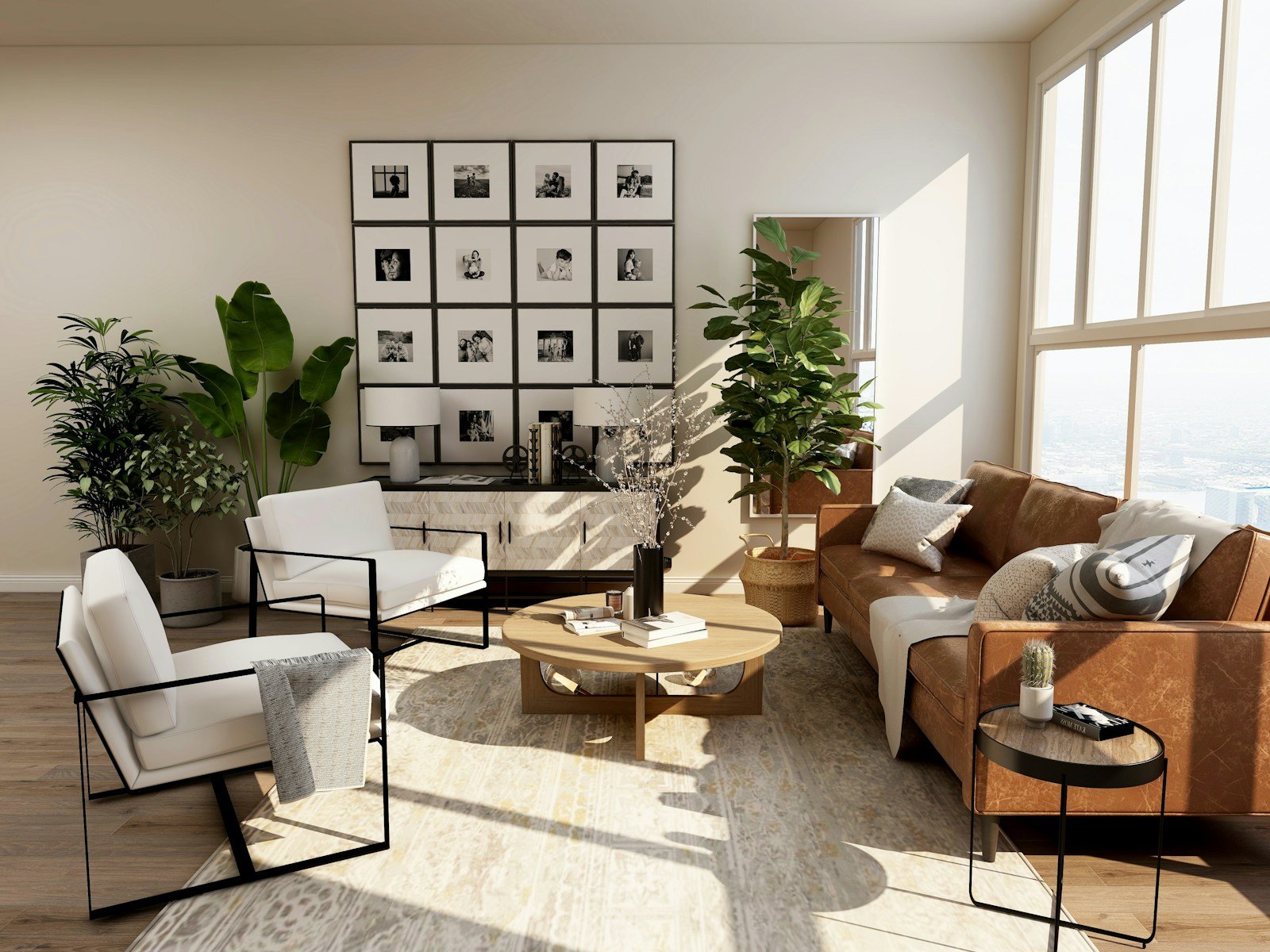
A space feels easier to read when one material has a clear role. It might be the wood floor, a large stone surface, or the texture of a sofa. Begin with the element that already occupies the most visual space.
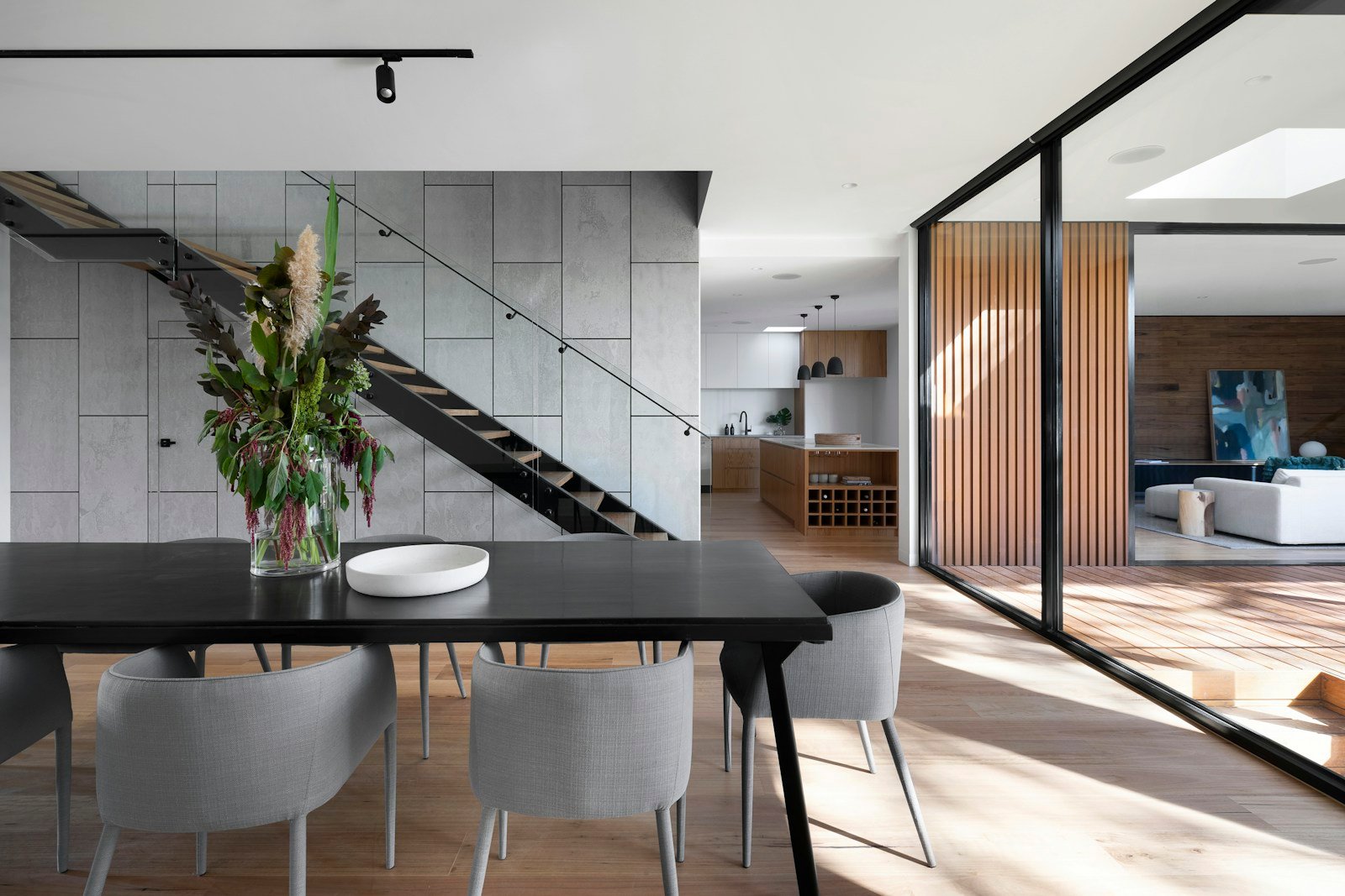
Supporting materials can contrast with that element without competing for attention. A room does not need equal amounts of wood, metal, stone, and fabric to feel complete.
Look at undertones together
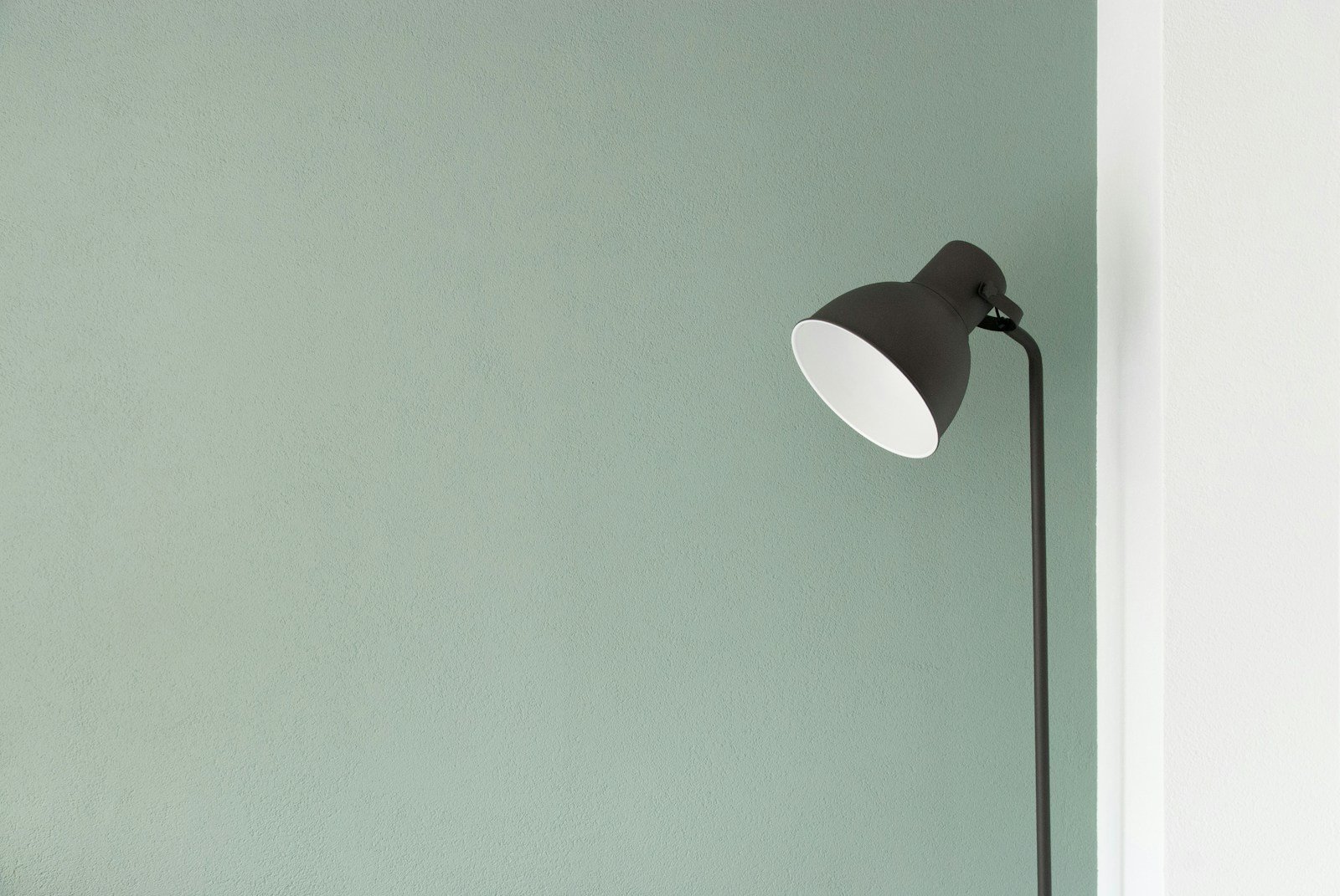
Two surfaces can both be described as beige while looking very different side by side. One may lean warm, another cool. Look at samples together in the room rather than judging each in isolation.
View them at different times of day. A small sample under store lighting does not show the entire relationship you will see at home. Keep the comparison simple by changing one material at a time.
Balance texture as well as color
A smooth surface and a textured surface reflect light differently. Combining them can create depth even within a restrained color palette. Soft textiles can make a room of hard surfaces feel more inviting.
Texture also affects how close an object asks you to look. A woven surface, visible grain, or subtle variation in a finish can reward attention without needing a strong color.
Leave room for the existing pieces
An interior can feel personal when a few pieces do not match perfectly. Instead of replacing them immediately, look for a shared detail that connects them to the room.
The connection could be a repeated curve, a similar wood tone, or a small amount of the same color. A palette is a framework for decisions, not a requirement that every object belong to the same set.
ONE IDEA TO TAKE HOME
Place your three main material samples together in the actual room before choosing an additional finish.
Keep this perspective for later.
Open your reading list ↗Neayer publishes general design observations and original editorial ideas. This article is not a report on a named architectural project. Our editorial approach